How Power BI Dashboard Examples Can Simplify Complex Data
In the data-heavy environment of today’s businesses, more information is being collected than at any previous time. From customer actions and purchases to financial projections and supply chain analysis, the amount of data can be daunting. The problem is not the data itself; it’s in understanding what to do with it. Power BI dashboards are the next step. Power BI enables businesses to transform and visualize data through intuitive dashboards, which make it easy for companies to pull together reports and discover critical insights and new opportunities.
In this post, we will explore how Power BI dashboard examples can help deconstruct complex data, making them an indispensable tool for businesses of all kinds.
The Power of Visualization
Numbers and spreadsheets can be indecipherable, especially when they run on for dozens of sheets or consist of millions of rows. Power BI converts raw numbers into visual items like graphs, maps, and KPIs that can be quickly glanced at and easily comprehended. So, instead of sifting through hundreds of sales reports, a sales manager can glance at an overview Power BI dashboard that shows trends in monthly revenue, best-performing products and regions contributing to growth.
This visual narrative element of Power BI has the power to make daunting data not just more digestible, but actionable.
Real-World Dashboard Examples That Simplify Data
To see the importance of Power BI dashboards, here are a few real-world use cases divided by department and industry.
Sales Performance Dashboards: Sales team members typically have to handle large data sets — lead tracking, customer conversion and more. A Power BI sales dashboard pulls all this information together into one place, displaying data such as revenue growth, sales pipeline and win rates. Job sellers can prioritize activities and be more effective because they’ll know which products are performing best, and what opportunities exist.
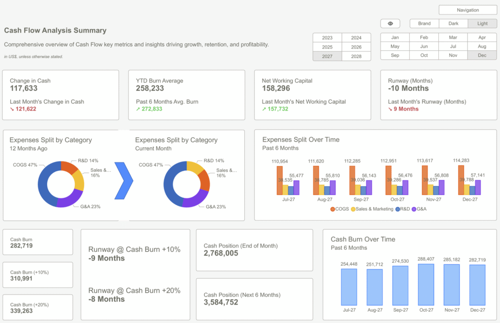
Financial Dashboards: Finance teams need to go through numerous records and sets of information, ranging from expenses and budgets to estimates. A financial Power BI dashboard can simplify financial analysis by providing a visual representation of expense categories, profit margins, and year-on-year comparisons. Through interactive drill-downs, CFOs can go from a bird’s-eye view into specific expense breakdowns without accessing dozens of reports.
Marketing Dashboards; Analytics, performance data – from campaigns to website traffic, to social media engagement and ROI. Marketing teams need analytics! So instead of having to track data across multiple platforms, Power BI brings it all into one view. Additionally, a marketing dashboard displays metrics such as cost per lead, customer acquisition costs, and campaign ROI, allowing you to identify the most effective channels.
Healthcare Dashboards: Patient and operational data are critical for healthcare businesses. Power BI dashboards might monitor patient reporting, hospital occupancy or treatment efficacy. For example, they can view real-time bed availability or analyze how long patients wait for service on the front end.
Executive Dashboards: Great leaders and decision-makers, keep it basic. Dashboards for the executive team displaying the health of the business as a whole, i.e., sales, financials, customer satisfaction, and employee productivity. Rather than shuffling through a handful of reports, they can see all necessary KPI’s in one location and react to data faster.
Key Features That Simplify Data
These dashboards are not robust because they have advanced features for complicating information. Power BI dashboards are powerful because they include features designed to make complex information annoyingly simple:
Interactive Filtering: ‘Visual click’ lets users drill down into details, making one chart several views.
Live Updates of Information: Dashboards can fetch live data from various systems, enabling decisions to be made based on real-time information.
Visual Customization: Regardless of pie charts or geographic maps, Power BI offers customized graphics so dashboards work for different businesses.
Cross-Platform Accessibility: You can easily share Dashboards across desktops, tablets or mobile devices so your decision-makers always have access to the information they need.
Final Thoughts
Painful data isn’t always painful; it doesn’t have to be. With Power BI, businesses can transform numbers into insights by creating eye-catching data visualizations for a more natural way of understanding their business. Whether it is a sales division monitoring its pipeline operating results or the finance department tracking budgets, Power BI dashboards can demonstrate just how easy data analysis can be when appropriately visualized.
In a data-centric world where information is only getting bigger, tools like Power BI are no longer nice to have — they’re critical for moving from insight to action.


Leave a Reply
Want to join the discussion?Feel free to contribute!