S Curve vs Baseline Curve: What’s the Difference in Project Management?
Tracking project progress without visual aids can feel like flying blind. You might know the destination and timeline, but without clearly seeing where you are and how you’re performing, you risk delays, cost overruns, or even project failure.
That’s where s curve in project management becomes your secret weapon—and today, we’ll explore the often-confused concepts of the S Curve and Baseline Curve so you can track and manage projects like a pro.
🔍 What is an S Curve in Project Management?
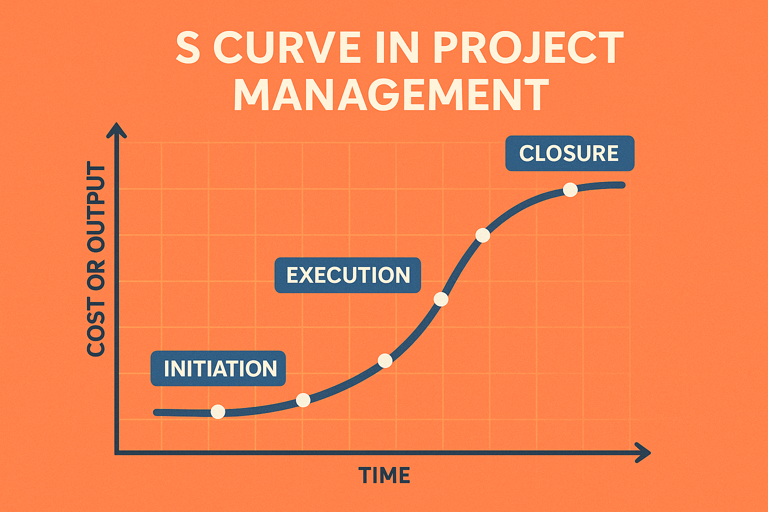
In simple terms, an S Curve is a graphical representation of cumulative project data—typically cost, time, or resources—plotted over time.
Why “S” Curve?
- Because the shape often resembles the letter “S”:
- Slow start (initiation phase)
- Steep climb (execution phase)
- Tapering off (closing phase)
It helps visualize project progress, performance, and productivity.
Types of S Curves You Should Know
Understanding the different types of S curves is key to mastering s curve in project management:
- Planned S Curve
Shows the intended progress of work or cost over time based on your original project plan. - Actual S Curve
Displays how much progress or cost has occurred in reality as the project progresses. - Earned Value S Curve
Reflects the value of the work actually completed, helping you measure performance and forecast trends.
Each of these curves plays a unique role in decision-making throughout the project lifecycle.
📊 What is a Baseline Curve?
A Baseline Curve is your project’s original roadmap. It sets expectations for:
- Schedule (when tasks should start/end)
- Cost (how much should be spent by when)
- Scope (what should be delivered)
How is it different from the Planned S Curve?
While both seem similar, there’s a subtle difference:
- Planned S Curve is generated from baseline data.
- Baseline Curve is a fixed reference. Once approved, it doesn’t change unless there’s a formal scope or schedule change.
So think of the Baseline Curve as the unchanging yardstick and the Planned S Curve as a representation derived from it.
🔁 S Curve vs Baseline Curve: Key Differences
Let’s break it down:
| Aspect | S Curve | Baseline Curve |
|---|---|---|
| Purpose | Track progress (planned vs actual vs earned) | Set original project expectations |
| Dynamic or Static? | Dynamic (updates with progress) | Static (until rebaselined) |
| Based On | Project metrics over time | Original project plan |
| Used For | Performance tracking, forecasting | Benchmarking and variance detection |
| Shape | Usually S-shaped | Can vary depending on the metric and timeline |
This comparison helps you understand when to use each curve and what kind of insights you can gain from them.
🔍 Planned vs Actual vs Earned Value S Curves
Here’s where the magic of s curve in project management really shines: using multiple curves on a single graph to detect variances.
✅ Planned S Curve
- Represents your original project schedule and budgeted cost.
- Answers: “Where should we be right now?”
📉 Actual S Curve
- Tracks real-time project performance.
- Answers: “Where are we actually right now?”
📈 Earned Value S Curve
- Represents the value of the completed work.
- Answers: “What have we earned based on work done?”
These Curves Help You Track:
- Time performance (schedule variance)
- Cost performance (cost variance)
- Project health (earned value metrics)
When used together, they form a powerful trio to forecast delays, cost overruns, or early completions.
🚀 How to Use These Curves Together in Real Projects
Let’s visualize a real-world project:
Scenario: You’re managing a 6-month website development project.
- Your Baseline Curve shows the full 6-month plan for work and cost.
- Your Planned S Curve suggests that 40% of the work should be done by month 3.
- Your Actual S Curve shows only 25% of the work is completed.
- Your Earned Value Curve shows that only 20% of value has been delivered.
What Does This Tell You?
- You’re behind schedule and over budget.
- Time to investigate, reallocate resources, or adjust scope.
Pro Tip:
Always analyze these curves together—looking at one in isolation gives you only part of the story.
🧠 Tips to Avoid Confusion Between Curves
Mixing up these curves is common. Here’s how you can avoid it:
- Label your curves clearly: Planned, Actual, and Earned curves should be distinct in your charts.
- Never confuse Baseline with Planned: The baseline is fixed; the planned curve may shift with updates.
- Use project management tools: Tools like MS Project, Primavera, or modern dashboards make curve tracking easier.
- Review regularly: Weekly curve reviews help identify issues early.
- Teach your team: A shared understanding avoids misinterpretation.
✅ Final Thoughts
The s curve in project management isn’t just a pretty chart—it’s a powerful visual storytelling tool that can make or break your project tracking process.
By clearly understanding the difference between the S Curve and the Baseline Curve—and how to use planned, actual, and earned value curves together—you’ll:
- Make data-backed decisions
- Identify problems before they escalate
- Deliver successful projects, every time
Next time you’re knee-deep in a project, let these curves guide you to clarity and control.


Leave a Reply
Want to join the discussion?Feel free to contribute!